You can use many different platforms to create classroom decor to give your room a look you would like without the price tag that often comes with it. The biggest thing to remember when deciding what platform to use is that a slide show creator option will be easier to work with than a Word or Doc platform. The four big platforms that people gravitate to traditionally are Google Slides, Microsoft PowerPoint, Canva, and, for Apple users, Keynote.
Today, I’ve prepared a simple How-To tutorial for creating classroom decor using Google Slides. Join me while we work together to make an alphabet to display on the wall!
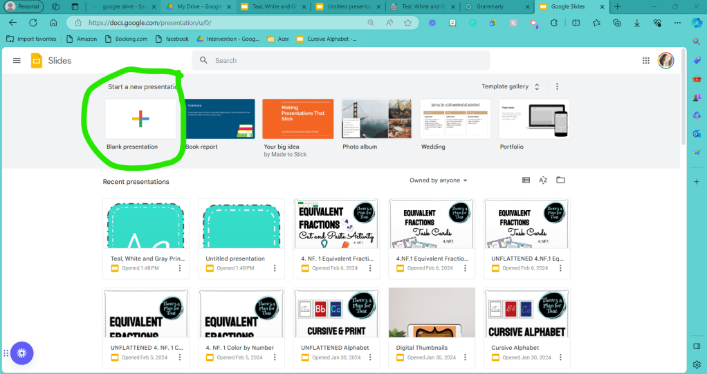
Step 1: Open up a blank presentation on Google Slides.
PowerPoint is typically displayed across the screen; therefore, the dimensions of your files don’t automatically match printer paper. Before you put effort into designing your page, let’s change the measurements to fit on standard printer paper.
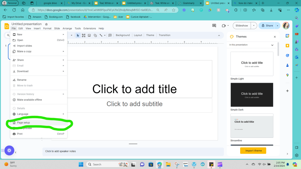
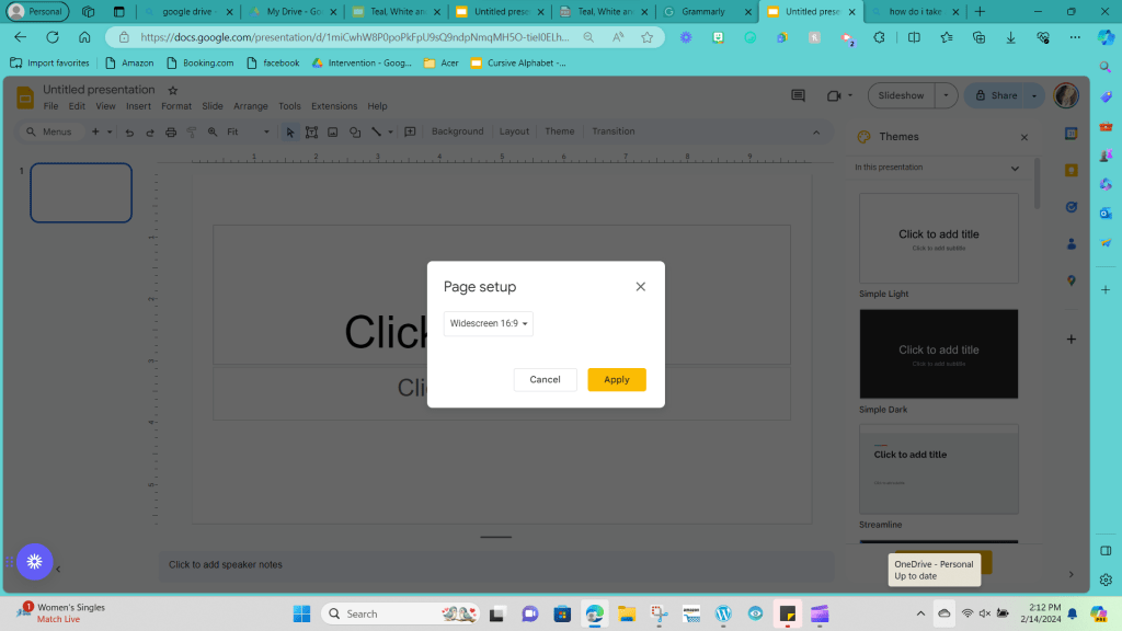
Step 2: Click File in the upper left-hand corner. You want to drag your mouse over the drop-down menu until you find “Page Setup” and click on it. (This will be towards the end of the screen.)
Step 3: A drop-down menu should pop up that says 16:9. Standard printer paper has dimensions of 8.5 inches by 11 inches.
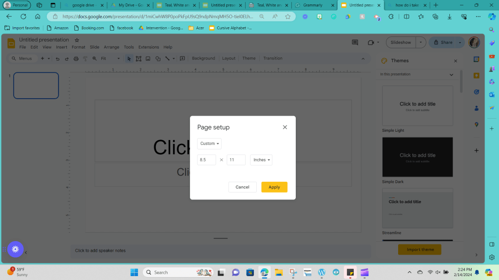
Click on the drop-down menu and choose “Custom” to add the proper dimensions.

Type 8.5 in the first box and 11 in the second box, then click apply.
Your screen should now look like a tall vertical rectangle.

Step 4: Go ahead and erase all of the text boxes that are automatically on your screen; you want to be able to change the screen as needed to fit your vision. You can click on the boxes individually and click the backspace button to clear the screen, or you can hold down the left-click button on your mouse and drag your mouse across the screen until everything is highlighted and then press backspace to delete everything simultaneously.
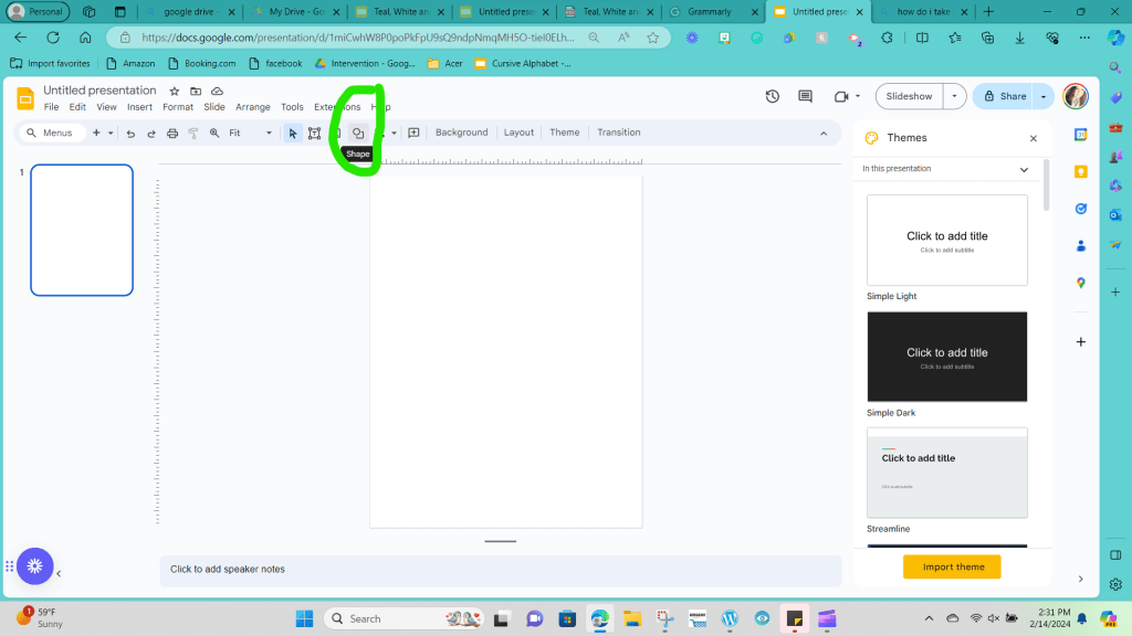
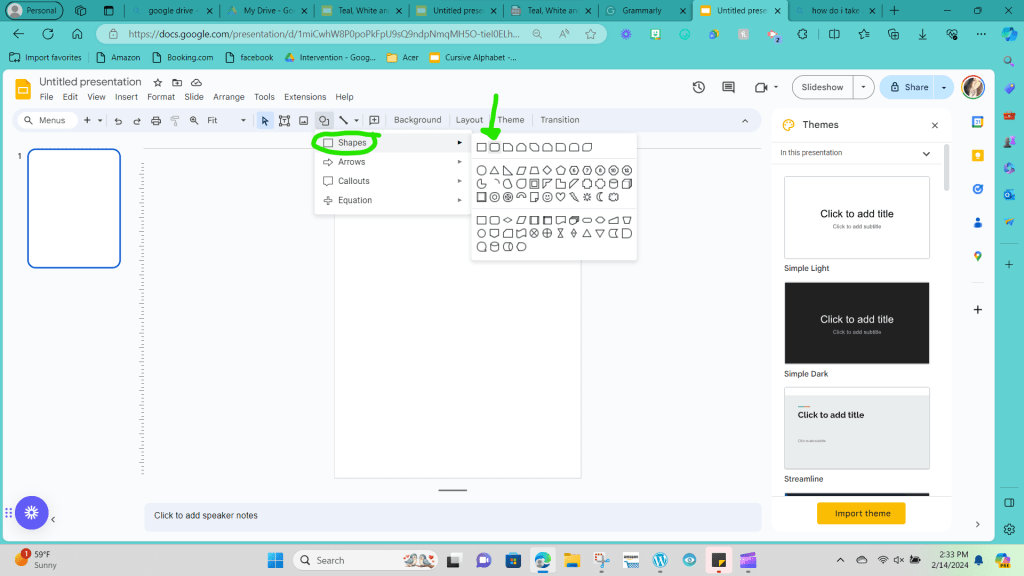
Step 5: Next, we will create the shape we want our alphabet cards to look like. To get to shapes, you will drag your mouse up to the taskbar across the top of your screen, and you will choose the button with a picture of a circle and a square overlapping each other.
Then, you want to hover your mouse over the word shapes and select the shape you want to be the base size of your cards. You can choose any shape you like. I like the rounded rectangle option.
Step 6: Once you’ve clicked on the shape you want, you need to draw the shape on your screen. To do so, you left-click and hold the button where you would like your shape to start, and then you drag your cursor over to the area you would like your shape to stop at. Then, you release the left click, and your shape will be set. (Remember, you can adjust the sizes by clicking on the corners of your shape and dragging it to larger or smaller if you aren’t satisfied with the sizing.)
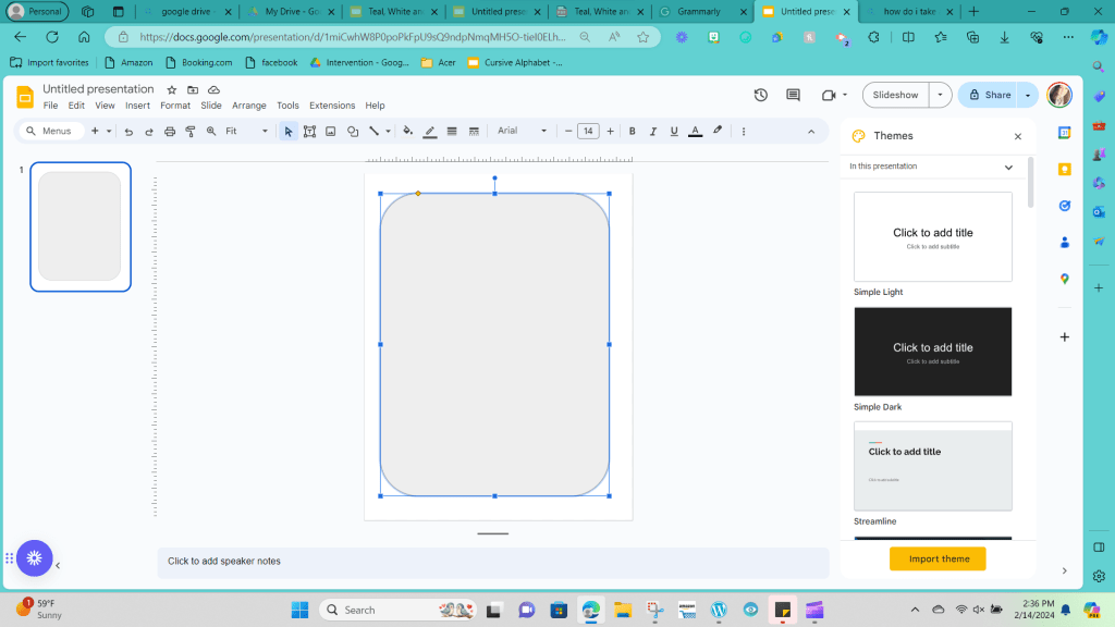
I wanted to use the specific dimensions of 7.5 by 9.75 in to make my rounded rectangle.
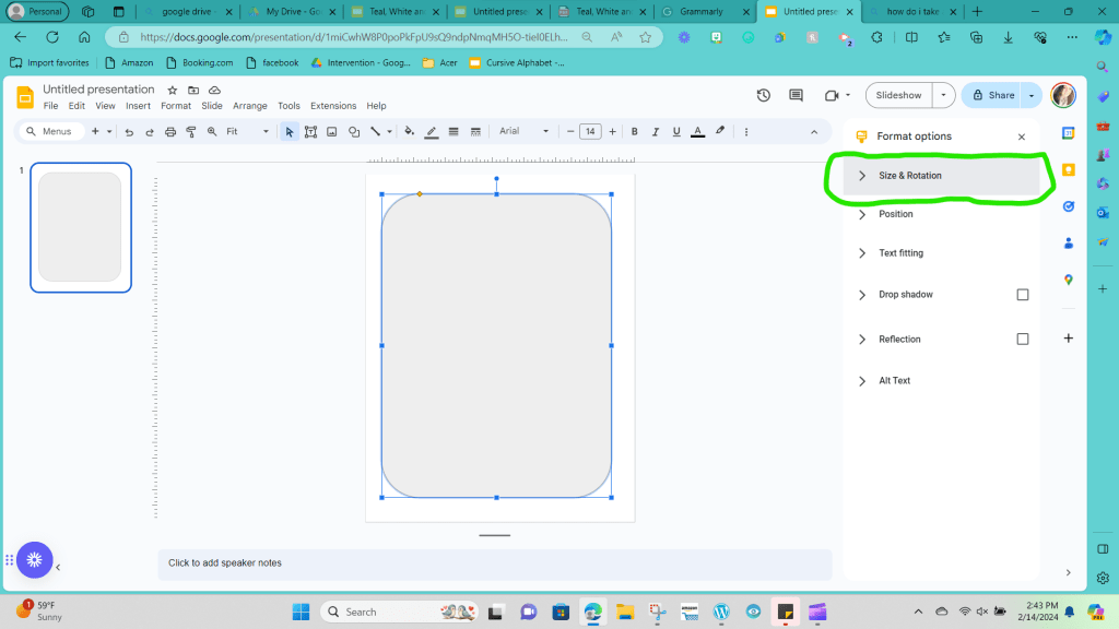
If you’d like to use those specific dimensions on your shape, click the three dots at the end of the taskbar at the top of your screen. Selecting those three dots will give you more taskbar options.

Out of those choices, click “Format Options.”

Now click back on the shape you created, and click on size and rotation.
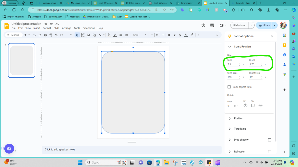
Where it says width, type 7.5, and type 9.75 for height.
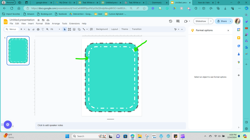
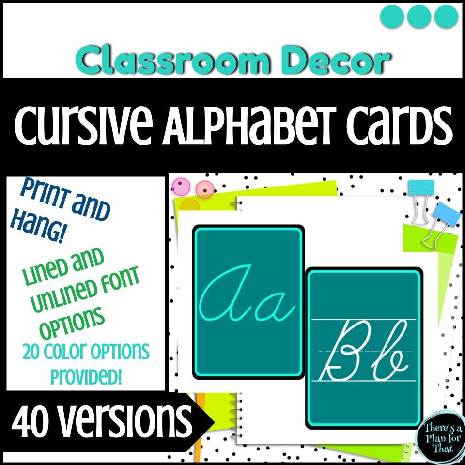
Step 7: Once your shape size has been created to your liking, it’s time to decide on your colors. I’ve chosen teal, white, and gray colors for this set of examples. These were the colors that I based my entire classroom decor on, so all products I created would draw from those base colors to add a cohesive element to the room.
Step 8: With those color choices identified, click on the image and then click on the paint bucket option from the top toolbar.
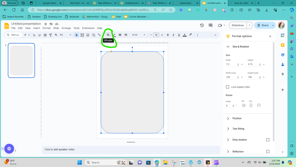
This will open up a variety of preset color options. You are free to choose from these options, but for what I need, the teal color I would like to use isn’t readily apparent. That’s okay; I will click the circle with a plus sign under the custom category.

Drag the circle on the bar until you’re in the color range you are looking for.
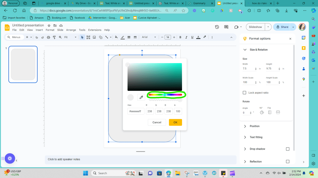
You can click up on the rectangle full of color shades and drag the circle around that rectangle until you’ve decided on the shade you would like.

Pro tip: to help with cohesiveness, once you’ve decided on the exact shade you want in your classroom, write the code that shows up under the Hex box down somewhere that you can quickly re-access. Then, when creating other resources, you can choose that specific hex code by typing it in, and you won’t have to drag the colors around to find that exact shade again.

If you are stressed out trying to create the perfect shade, you can always google hex codes in the color type you want and type that code directly.
In this example of the alphabet I’m creating, I used the teal with the hex code #35decaff.
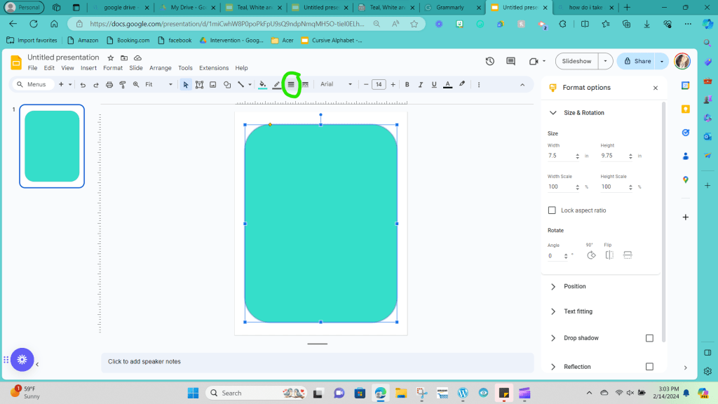
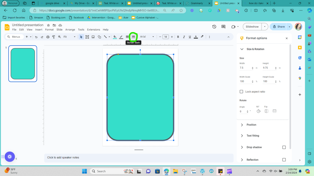
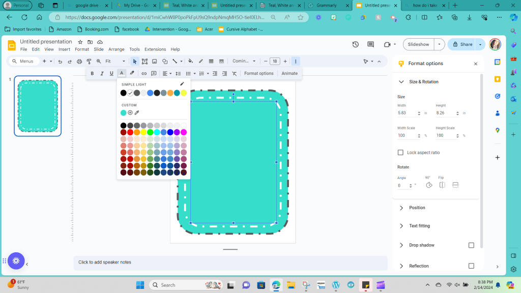
Step 9: Now that you have the inside color, let’s work on the border. I prefer having some color around the edges of your posters; it is a great way to help your pieces stand out and make a more significant statement on your walls. There are three elements on the border that you can adjust: the color, the thickness, and the line pattern. To change the color, click the icon next to the paint bucket that looks like a pencil over the top of a line. In my example, I chose to make the border dark grey.

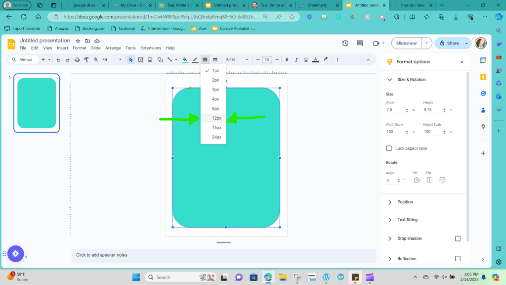
Step 10: When you first change the border, you’ll notice that it looks pretty thin. A thin border wouldn’t be an issue if it were a printable worksheet. Still, it’s important to remember that we are designing a piece to go on the wall, so we want to make sure our lines are thick enough to be seen by someone sitting across the room.
To adjust the thickness of your line, you go back to the options bar at the top, and next to the border color, there is a symbol with four lines stacked on top of each other in varying thicknesses.
Click on that button and choose what thickness you would like; I chose a size 12 for my example.
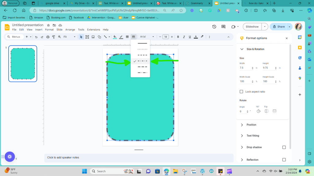
Step 11: Next, you can edit the line border style if you like. Editing the border style is another option that is a personal preference. To edit the style, you want to click on the picture with four lines stacked on top of each other and broken up into dots and dashes.
In this example, I chose the fourth option, consisting of a mix of dots and dashes.
This next step is optional, as you can decorate your cards with as much or as little decoration as desired. I like to add more filler to the space, but I still tend to err on the minimal side when it comes to decorations. Again, this all comes down to personal preference.
Step 12: I want to add a second inner border to my alphabet cards. There are two ways you can accomplish this. You can copy and paste the original shape and click on the sides to drag and shrink the shape to make it smaller and place it in the middle of the page.

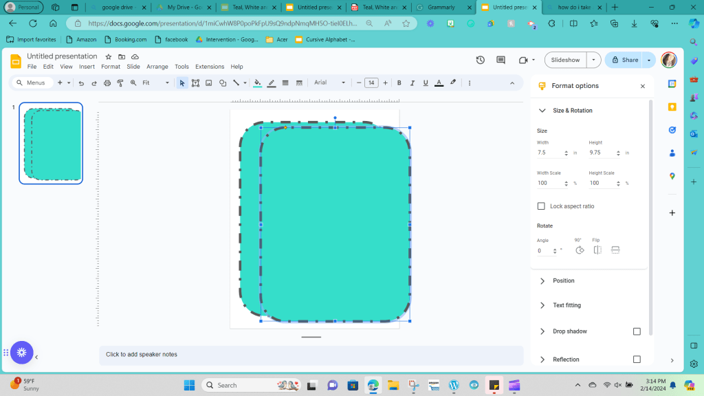
The second way is to create a new shape by clicking the shape icon (the circle over the top of the square shape at the top menu bar).

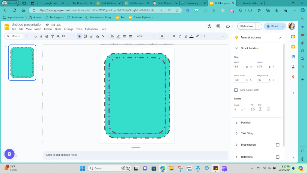
The rectangle’s dimensions with curved edges I added were 6.5 inches x 8.75 inches.
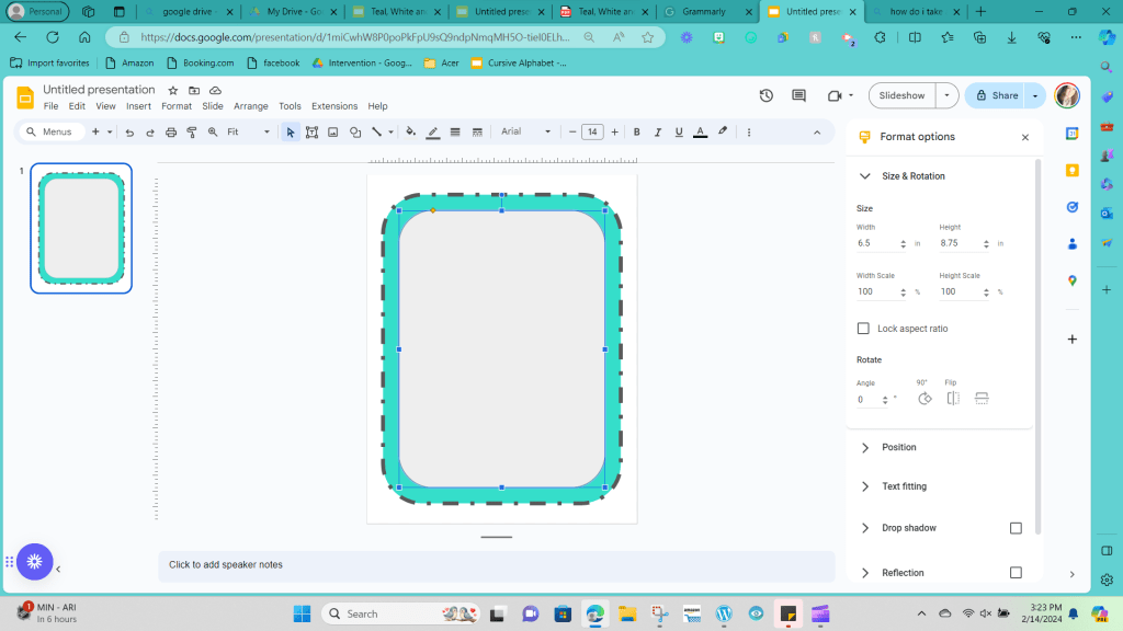
The goal of this second shape is to add a second element to the border; however, I’m not interested in adding a secondary primary color for the card. Therefore, I clicked on the color paint bucket icon and chose the option for transparency.

I also changed the border’s thickness to match the outside edge to a size 12.
So, my second border is white, with a dashed and dotted pattern. (You can reread steps 8-11 to replicate these steps on your page.)
Step 13: Now, it’s time to add our alphabet letters. Returning to our taskbar at the top of the screen, we need to click on the T inside the square with square corners.
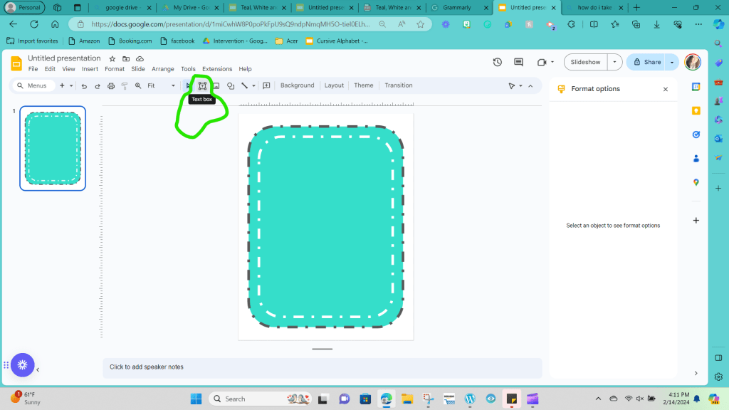
You’ll left-click and hold where you would like your textbox to start and then drag your mouse until your cursor is where you would like the textbox to stop and release the button.

Step 14: Here’s the fun part! You get to pick your font. You’ll put a little bit of thought into this for two reasons. First, ensure that your font is legible and has proper letter formations. Many of the fonts available are cute, but the script fonts especially have improper letter formations when considering students still taking in the basic expectation of handwriting. The second element you want to feel is choosing a font that can be used in all the different decor pieces you create in your classroom to help build the cohesive look of your decorations. In this example, I chose the “Coming Soon” font. I also like the “Comfortaa” as an option to try.
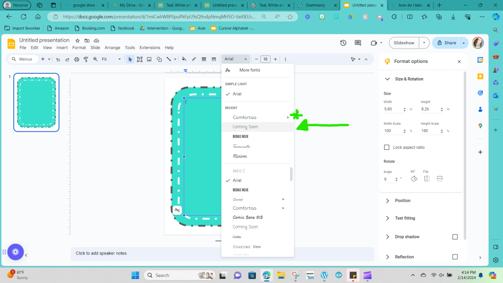
One potential drawback of the Google Slides platform compared to some other platforms is that you are restricted to only the fonts offered on the Google platform; you can’t upload any of your personal fonts to use.
Step 15: It’s time to choose your font color. In this example I chose white. I went with white because it helps tie in the second shape in the middle of the card, and it would pop well against the teal. The white is also one of the three colors that I used in my class decor.
To change the color of the font you have to click on the textbox. Then click on the three dots at the top of the menu bar on the far-right hand side. This will bring up additional features.

You’re looking for the icon that has a capital ‘A’ that is underlined.

When you click on that icon it will bring down a drop down for you to choose what color you would like. Remember you can always refer back to step eight if you need help remember how to create a personalized color for your project.
Step 16: Go ahead and fill in your text box with your first letter; most alphabet display cards have an example of each card’s capital and lowercase letters. Your card should now say Aa. (It will look too small. We will fix that in step 17, don’t worry!)

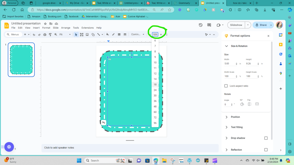
Step 17: Now that your font has been chosen, you want to size it to fit the space. I found that size 325 worked well on my alphabet cards for this space. (Some letters like M and W will need to be resized when you get to them in a few steps.)
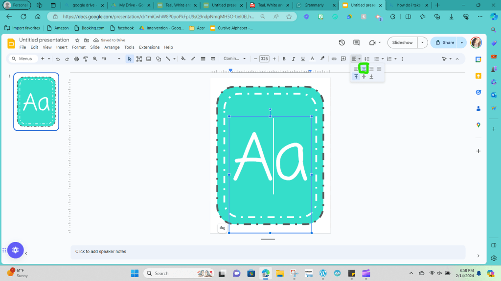
Step 18: The next step is to center your text in the text box to ensure your page is balanced. To center your text box, you first need to click on the text box.

Then, going to the right side of the top menu bar, you will click on the five lines stacked on each other, alternating from long to short.

When you click it, you will see various ways to line up your text; you want to choose the second option on the top row, which looks like all lines are lined up in the middle of the picture, not farther to the right or left sides.
Step 19: Review the card and decide if there are any other elements you want to add, and make sure that everything is placed and arranged the way you would like. This card is a template of sorts.
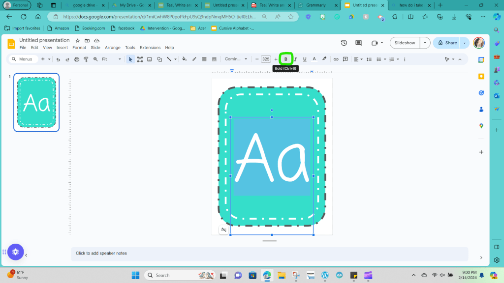
One element that you might consider adding is bolding the font to make it easier to see from across the room. I did bold the font in my example. To do this you need to click on the ‘B’ icon on the far-left side of the drop-down menu.
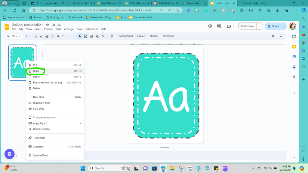
Step 20: Once you are satisfied with how your template card looks, you will want to right-click on the card icon you can see on the left side of your screen. This will bring up a drop-down option where you will select the option to copy.
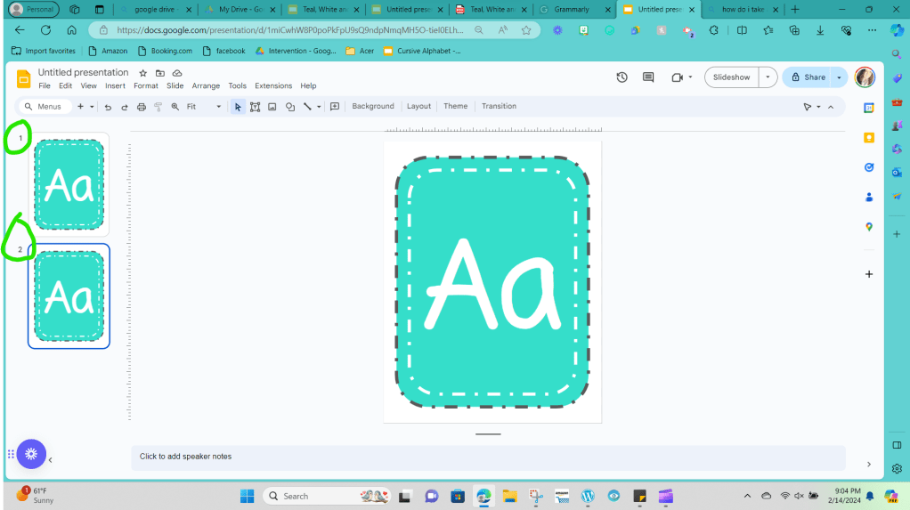
Step 21: Right-click again, and this time, select paste.

You should now see two identical slides on the left-hand side.
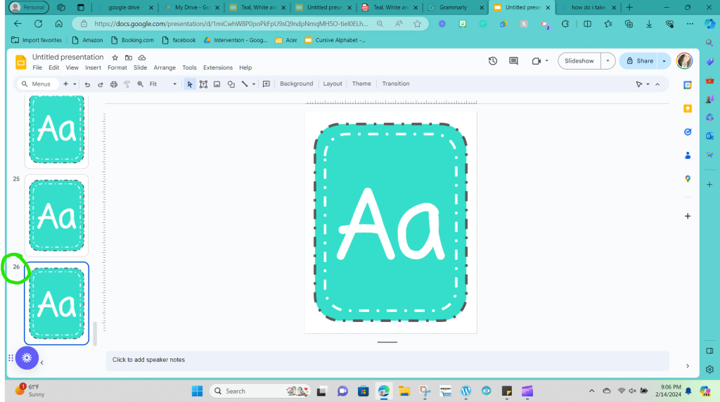
You want to repeat this step until you have 26 copies of the card, one for each alphabet letter.
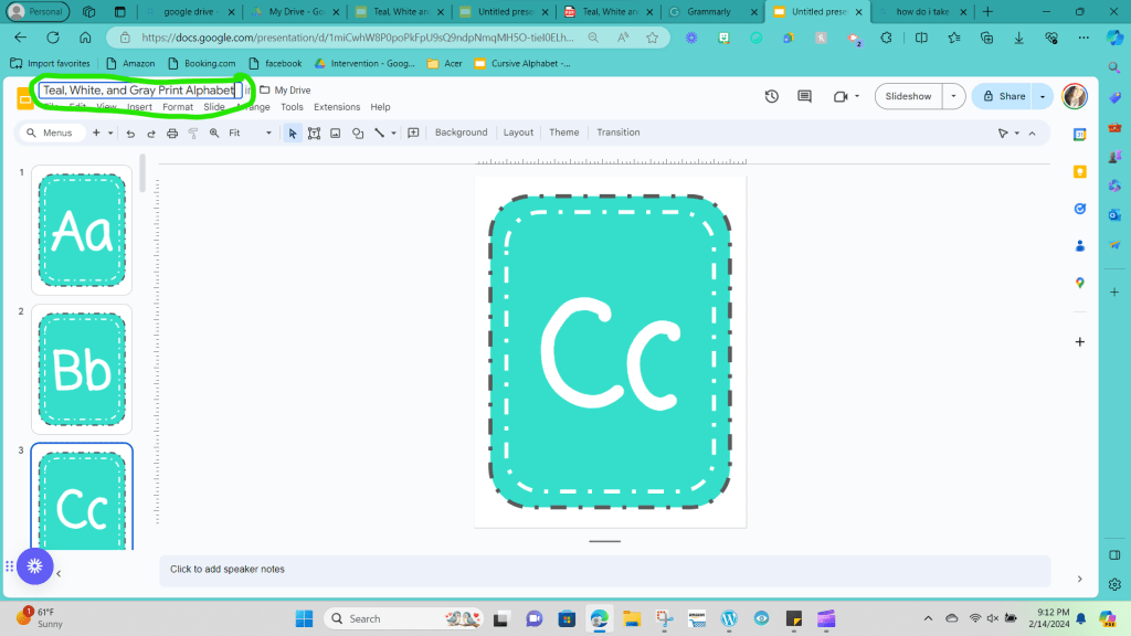
Step 22: Now click on each slide on the left side of the screen and update the letters for each letter of the alphabet. Slide 1 should be Aa, slide 2 should be Bb, and slide three should be Cc, etc.

Step 23: Now that you’ve completed your alphabet cards, let’s give your File a name so that you can easily find it in the future. Looking at the top left-hand corner is a box labeled Untitled Presentation.
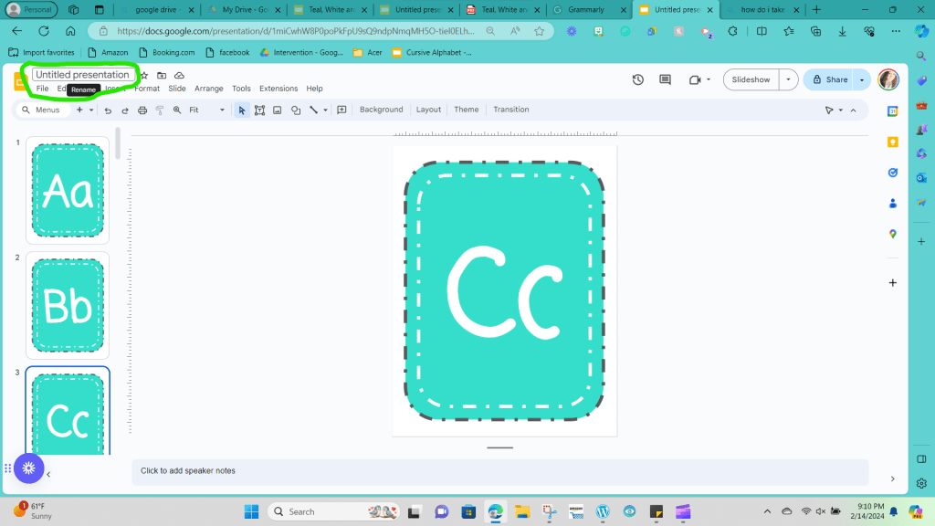
If you click on that box, you can type what you would like your File to be called; I titled my example Teal, White, and Gray Print Alphabet.
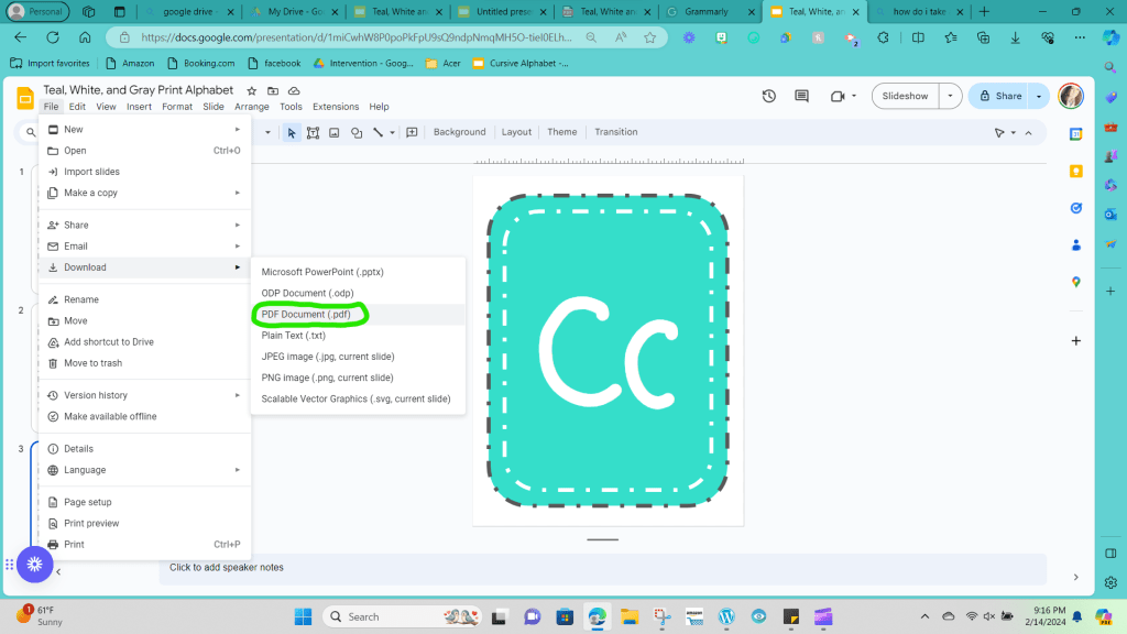
Step 24: Our final step is to save your File to your computer, and you are done! In the upper left corner, click on the drop-down menu that says File, and bring your cursor to click on Download.
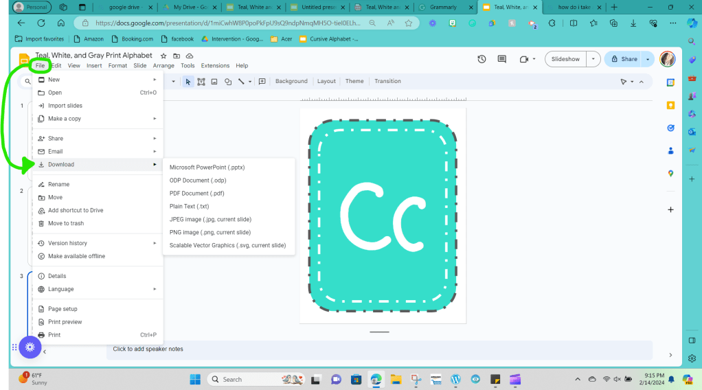
Next, you want to click PDF, and your File should automatically download to your computer.
You are ready to print now that you have created your very own set of alphabet letters. Once I print out my cards, I like to laminate them using a matte finish lamination page to help keep the cards durable.
I completely understand if you don’t have time to do all of these steps right now. Getting ready for school can be overwhelming, and there isn’t enough time in your day to do everything.
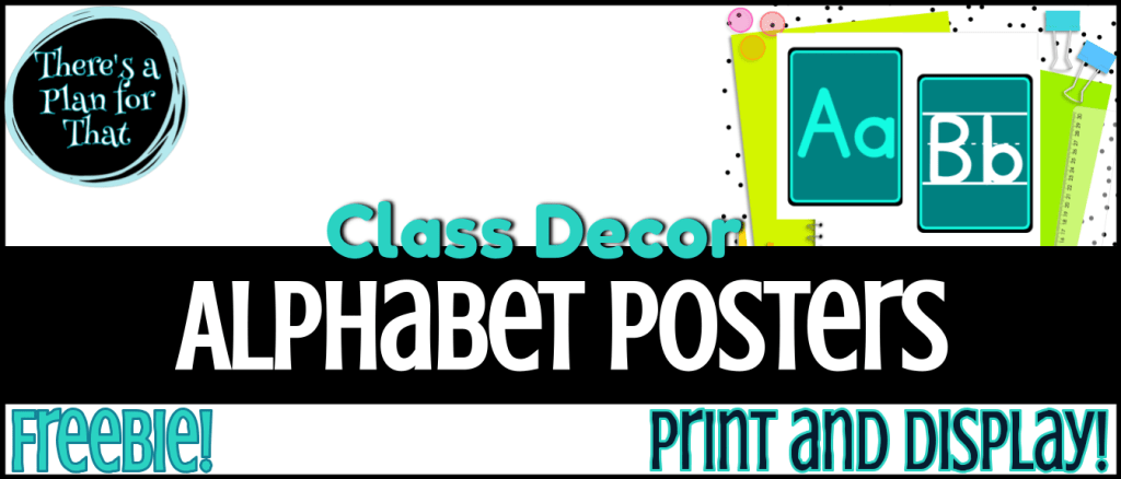
To help you, I’ve created an alphabet Freebie you can print and use in your room immediately. Ensure you join my email list to access this Freebie and more in the Free Resource Library.
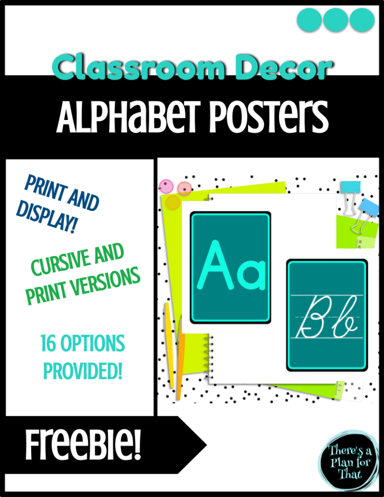
If you’re looking for more options, check out these alphabet bundles on my store, ‘There’s a Plan for That‘ on TPT.

Have fun setting up the rest of your room, and I’ll catch up with you in the next post!


Leave a comment